When I first saw print ads featuring a prime when they meant to use an apostrophe, I considered it the sign of another amateur who got his first computer. When a similar gaffe appeared in a Time Magazine ad—the ad must have cost $30,000—I could imagine how my parents felt when we kids all began growing our hair long like the Beatles. The world was coming to an end.
I blame the typewriter.
I have a love/hate relationship with typewriters. I still have a classic Underwood on my desk, just because it is such an inspiring mechanical marvel. Modern computers fail to amaze us anymore because we don’t see the magic happening inside. We just take it all for granted. With a typewriter, you can watch every lever and hinge connect finger to page like so much sinew and muscle. It is a miracle of design.
I forgive a typewriter for not having proper punctuation. As a print book and eBook designer, I’m less forgiving when we now have all the computer tools at our fingertips to set type almost as well as Johannes Gutenberg did in the 1400s.
There’s only so much room on a typewriter keyboard, and every extra key requires more levers and hinges and strikers. There is a lot of double-duty going on. A single prime*, ‘ , used to denote a foot of measure, was asked to also substitute for an open quote ‘ mark. And a close quote mark ’ while you’re at it. Same for the double-prime ” originally used as shorthand for inches or minutes.
That’s not the least of the compromises. Look for yourself: many manual typewriters don’t even have a numeral 1 . Typists were taught to substitute a lowercase l (el) instead. (Depending on what font you’re seeing now, those two may look the same!)

Nevertheless, it was a huge improvement over some people’s handwriting. Typing was undeniably faster, and nobody used typewriter text in a $30,000 Time Magazine ad. For that, we’d hire a real typesetter who used real quotation marks. (And real ellipses.)
The problem arose after a whole generation of people were raised using manual typewriters. Then came word processors, and soon after that, computers—all based on the simplified keyboard.
We type compromised characters even though today’s computer fonts contain every correct symbol imaginable. It just takes some nutty, arcane fingerwork to get there. Most people no longer know there is a difference. With all that computer power creating professional quality print, every amateur became a “graphic artist.”
Today, most word processors make the correction for you, judging by context. They turn your single prime into an apostrophe, your double-prime into open and close “curly quotes.”
Great, right?
Almost. Except now I’m seeing this:
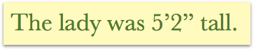
[ forehead slap ]
Now that’s a prime example of the wrong way to use foot- and inch-marks. Get it?
*Actually, it’s even worse than that. True primes and double-primes lean a bit to the right. They were straightened specifically for the manual typewriter so they could be used on both sides of a word. Ironically, the straight ” and ‘ don’t seem to have existed before the manual typewriter, and thus in the world of typography they aren’t correct for anything.
 "Mick" is Michael Campbell, a book designer, graphic artist and writer. His humor column, The Dumpster, closes every issue of Food & Spirits Magazine. Author of
0 Comments