So I was thinking… how fast can I introduce the improper use of the ellipsis?
Not bad, eh? Just three words in.
It’s not curing cancer. But I’m a print book designer for independent authors. When your book goes out into the world, there are thousands of picky people like me who live for exorcising errors like that. I’m your man, dedicated to saving you the world-wide humiliation of Amazon reviews.
Strictly speaking, the ellipse is used when something is missing or unfinished. Like when I quote “Four score and seven years ago…” and don’t finish the rest of the quote. While many people use it to convey a pause in thought (as in the first line above), that is better done with a M-dash. Like:
“So I was thinking—”
“About what?”
“About the ellipse.”
An M-dash (sometimes called an em-dash) is so named because it’s about as along as a capital letter M. It’s one of the few perfectly named typographical glyphs, although I think it’s ironic that it has a regular dash in it’s name. I’d propose we call it the M—dash, but then it sounds like I’m pausing in the middle. (If you’re still awake, check out my discourse on dashing.)
The ellipse is often used to denote a reflective pause, when the writer wants to appear thoughtful… as if dreaming… of another world… where everyone hugs…
Yeah, just don’t do that.
In print book design, I don’t care if you use dot-dot-dot. People will fuss, but the bottom line with print has always been that if it looks good, it doesn’t matter how you got there.
eBook design and other digital documents present a unique challenge. eBooks don’t have a locked-down font size. Or font. Or page size, for that matter. With the tap of a button, the reader can change your carefully-chosen Minion Pro 10-point-over-15 typesetting and change it to 12-point Helvetica. Boom—the whole book recomposes itself. A word at the end of a line now finds itself in the middle of the next line. Web pages do the same thing: stretch the window, and the text inside it reflows to fill the new space.
That’s not a problem unless you have a habit of using dot-dot-dot for your ellipse. It’s possible that the first two dots will reach the end of a line in an eBook but not have room for the third dot, which will wrap to the next line. Like this:
Or when they want to appear thoughtful..
. as if dreaming… of another world…
Yikes. Not good. So while all your snobby typesetting friends argue about how best to present an ellipse, you now have a practical reason to use the proper ellipse character … in digital documents.
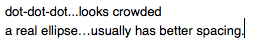
It usually looks the best anyway. Dot-dot-dot worked on a typewriter because the period had enough space on either side. Today’s word-processors have skinny little periods that nuzzle much too close together:
Many word-processors make the substitution automatically. You type dot-dot-dot, there’s a little whammy, and you get a real ellipse. To make the example above, I had to go through three different software programs to find one that wouldn’t auto-correct my example. Sheesh.
Now here is where I shall attract the wrath of snobby typesetters everywhere. [Helmet on, chinstrap secured] Leave a space after your ellipse character in digital drafts. Some devices consider the ellipse a regular character, and thus two words joined by an ellipse become one really long word. That’s a problem when your paragraph is eventually justified (flush to both left and right margins). Devices add a little extra space to word spaces to push a line to the right margin. If there aren’t many spaces (because of long words) the effect is magnified. When it reaches its limits, the device may even start ripping the words themselves apart to reach the margin, like this:

A space after your ellipse allows that long word combination to break cleanly if it needs to.
Some typesetters hate how that looks… a space after an ellipse. I don’t mind it at all, and I’m as fussy as they come. Many style guides even require the space, so you’ll be in good, snobby company.
 "Mick" is Michael Campbell, a book designer, graphic artist and writer. His humor column, The Dumpster, closes every issue of Food & Spirits Magazine. Author of
0 Comments