Before I start this post, let me be clear: no, I do not want to go out back and fight you.
If you invite three book designers to a party, one will disagree with the other two about what widows, orphans, and runts are, voices will be raised, drinks will be thrown, and you’ll have to kick them out, which isn’t too hard because typesetters usually aren’t very fierce.
The problem starts because these names are helplessly non-intuitive, and more than a little sexist and demeaning. Also because even Wikipedia and the Chicago Manual of Style can’t agree on the definitions. And partly because typesetters are irrepressible nerdy snobs.
What we can all agree on: widows, orphans, and runts are bad and must be killed.
Who cares?
I encountered this post recently: “Do orphans and widows still matter? I thought they were a think of the past, but my typesetter has left many throughout my memoir.”
YES! It matters, and NO! I’m not going to define widows and orphans. It’s a trap! But here are the three issues we’re trying to avoid:
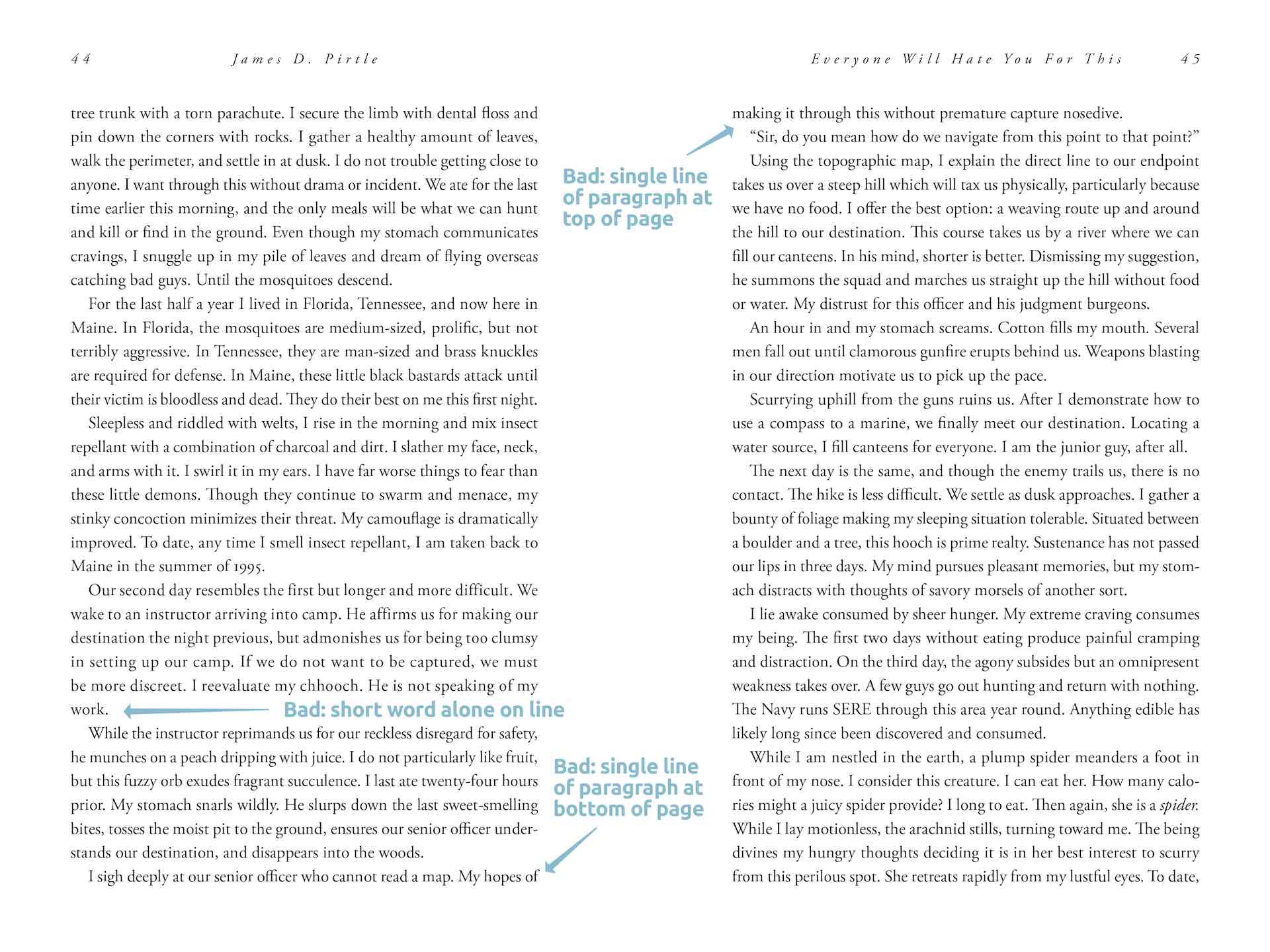
- A short word alone on a line at the end of a paragraph that makes the spacing look off, as if it’s double-spaced. (Worse, half a word, because it was hyphenated.)
- A single line of a paragraph alone at the bottom of a page looks awkward and interrupts the reading experience.
- A single line of a paragraph at the top of the page — or far worse, alone atop a page at the end of a chapter — looks equally awkward.
The three issues above are called widows, orphans, and runts. I don’t care which word you assign to which issue.
Just fix them.
Yes, they do matter. Widows, orphans, and runts degrade the reading experience as much as typos. Yes, your typesetter should have fixed them. (Otherwise he’s just a typist. And yes, I’ll fight you over those two terms.) And no, it’s not hard to fix them. You just have to care.
Another writer on the same post replied, “You must not be a writer. That’s too hard to fix. I’ve spent hours writing and rewriting my book to get rid of them, and I don’t have that kind of time.”
[ forehead slap ] First, sometimes a quick edit is the easiest way to correct these problems. But usually I’m designing a book for an independent author, and I’m not free to reword a rough spot. Consider these other options to make your book look its best.
The fix is in
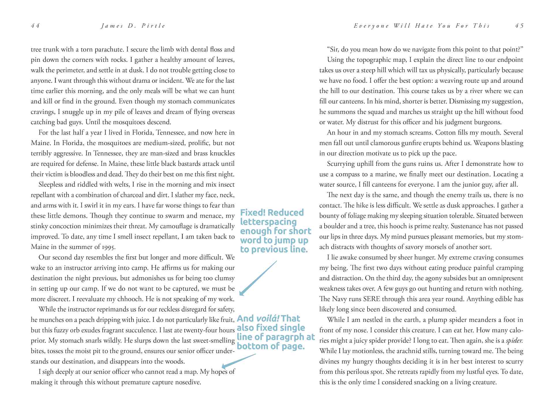
Fixing a single short word on its own line (often called an orphan, a widow, or a runt. See the problem?) If the paragraph is more than two lines long, select the entire paragraph and adjust the letter-spacing a tiny bit up or down. Usually you can get the lone word to snap up to the line above (as in the sample below), or get a companion word from above to jump down to keep the loner company. Keep your eye on the overall look, so you don’t change the spacing so much as to be conspicuous. You’ll be surprised at how much you can get away with. You can also experiment with the word-spacing and the hyphenation settings. Just google your software to learn where these settings are. (And notice how they all define widow, orphan, and runt differently.)
Fixing single lines at the top or bottom of a page: this one’s a snap, literally. Most word-processing and page-design programs have a setting that forces lines to stick together. Sometimes called “keep” options, you can tell it to “keep 2 lines together.” 2 is enough. Try setting it to 3 or 4 to find out why 2 is enough.
Adjust line height: If you can’t use the “keep” settings above, or you now have an unsightly space at the bottom of a page, adjust your line height to fill it. Again, all major software lets you do this. You just have to find where that setting is. It may be called line height, line spacing or leading—it’s all the same thing. Select all lines on the page and add (or subtract) a tiny fraction of the line height until the problem goes away.
 In the example above, I fixed the single-word-on-a-line problem by selecting its entire paragraph and reducing the letter-spacing a gazillionth of a fraction. The paragraph shrank enough to make room for that lone word to jump up to the line above. You can’t see the difference in the text. The paragraph doesn’t look crowded at all.
And Shazam! Since that paragraph is now one line shorter, the single line at the bottom of the page jumped up to make room for a companion, so the [ widow or orphan, select whatever word makes you feel better about yourself ] fixed itself! You’ll be surprised how often you get lucky like that.
Other cheats: add a pull-quote to the page. If there’s an image, adjust its size or the spacing around it to push your text around.
Is it worth it?
It sounds like a lot of fuss, but once you get used to where these settings are and how much you should adjust them, it’s just a few clicks to fix a problem. It’s faster than editing. I just spent less than two hours fixing all manner of typefit problems in a 325 page book.
Pull a few books off your shelf. You won’t see any widows, orphans or runts in any professionally-produced book. Because yeah, it matters.
Now, my apologies.
Once you understand why widows, orphans and runts are distracting, you’ll start seeing them everywhere, especially in self-published books. They’ll make you wince. You’ll be ruined forever. My fault, sorry.
On the other hand, sometimes it just can’t be helped. The whole point of this exercise is to make reading effortless: you don’t want the reader stopping to notice your layout. Occasionally you’ll do so much warping to fix a widow, runt or orphan that your fixes are more distracting than the original problem. If you’re not sure, lean back and look at the whole page, see whether anything looks off. I know some people who squint a little to fuzz their vision so they see the page as a single “thing,” to sense its weight and balance. Sometimes you have to accept a small distraction to avoid a bigger one.
Stories with lots of dialogue, which have short lines one after another, are going to look ragged. And a blessing is that the raggedyness helps hide those awkward line endings anyway.
Do it last: this is finish work. Don’t worry about any of this until after you’re done editing your book. You don’t want to undo all those hand-crafted line endings by adding a sentence at the beginning of the book and throwing everything off.
What about eBook design?
A nightmare or a gift, depending on how you look at it: eBooks don’t have literal “pages.” On every device like the Kindle, Nook, or iPad, the reader is allowed to choose different fonts and adjust their size, and the book’s text will reflow to fit. It’s fun and addictive, and completely ruins any effort to fix widows, orphans, and runts.
Like web pages, eBook pages are just boxes into which text is dumped. It might be tall and thin or squat and wide. The same eBook might be 200 pages on an iPad and 400 pages on a Kindle. (Adjust the size of your browser window to watch this story reshape itself. Same thing.) It’s out of the designer’s control. This causes some typesetters to jump out a window (don’t worry, they almost never have an office higher than the second floor), while other designers shrug, say “Not my problem,” and take the rest of the afternoon off.
I’d dazzle you with clever CSS code meant to help avoid these problems systematically, but as of this writing not a single eBook device supports this code, so let’s just all back away from that carnage for now.
Meanwhile, wanna make a whole lot of new acquaintances? Go online and announce, “Once and for all: here’s what widow and orphan mean…”

 "Mick" is Michael Campbell, a book designer, graphic artist and writer. His humor column, The Dumpster, closes every issue of Food & Spirits Magazine. Author of
Opened up two books on my bookshelf published in 2006 and 2013. Found so many runts. I need more proof that this is standard practice. Have any research that shows the effects of them? How much effect? I’d like to weigh the benefits vs time spent.
Your article on runts has runts in it.
Probably. And if you adjust your browser viewing window, you’ll get all new ones. Maybe someday we’ll have better font control over websites. We have the same issue when designing eBooks. [ sigh ]